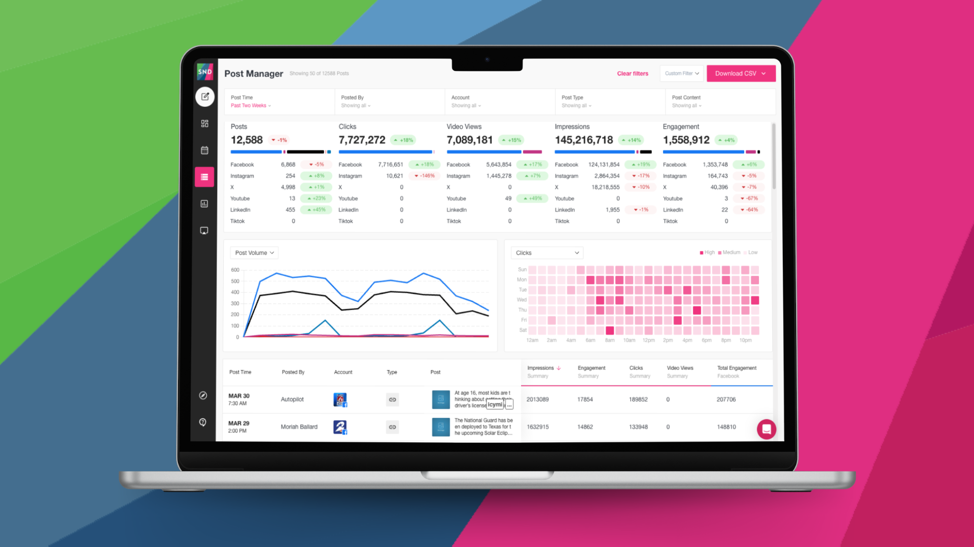
Want a quick and easy way to see when your posts are performing their best? Our newest update to Post Manager introduces new data visualizations that give you a heat map of post performance – whether you’re prioritizing link clicks, impressions, engagement or video views.
Pick the KPI that’s most important to you, and let Post Manager show you at what time during the week your content shines brightest.

We’ve also added a straightforward summary right at the top, to show you at a glance how your content is doing overall. Track how many posts you’ve made over a given time, and see an aggregate of the clicks, engagement, impressions and video views your content has gained during that time period – both overall and by social network.

While we’ve streamlined how we display top social metrics, all 80+ data points are still available in Post Manager if you’re into detailed data. You can also still export a CSV to review and analyze your metrics in the spreadsheet software of your choice.
We’ve also got a brand new Post Composer available in Beta, so if you’re an early adopter you can get your hands on it today! This update makes it easier to customize content for each social network, and we hope you’ll share your feedback with us at support@socialnewsdesk.com.